One important feature available in Downtime Tracking is the MTBF & MTTR (Mean Time Between Failure & Mean Time To Repair). Data collected over time from downtime codes provides charting information on the average time in between specific downtime failures on machines, and the average time it took before the machine was back online after any of these occurrences.
MTBF & MTTR Setup
From Downtime Tracking, select MTBF & MTTR (under the Analysis section).
Click the New ![]() icon to create a new MTBF/MTTR analysis chart.
icon to create a new MTBF/MTTR analysis chart.
Configure
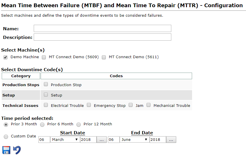
Enter a name and description. Select the applicable machine(s) to create a chart for, and the downtime code(s) you’d like to examine. Lastly, choose a time period from the radio selection buttons, and hit Save ![]() .
.
Your browser will redirect back to the MTBF/MTTR main page, which will display a list of all configured MTBF/MTTR charts. Your newly configured chart will be listed at the top.
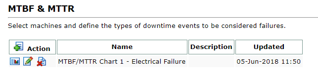
Chart Options
![]() – View the selected chart
– View the selected chart
![]() – Edit the selected chart configuration
– Edit the selected chart configuration
![]() – Delete the selected chart
– Delete the selected chart
Viewing MTBF/MTTR Charts
Upon selecting the View ![]() icon your chart will display showing details on your machine(s) and downtime occurrences based on your chart configurations.
icon your chart will display showing details on your machine(s) and downtime occurrences based on your chart configurations.
View Options
Use the selection bar at the top (near Configuration) to quickly jump to any of your configured charts.
Clicking the gear icon ![]() will take you back to the menu listing all configured charts, allowing you to create a new MTBF/MTTR chart configuration or edit an existing one.
will take you back to the menu listing all configured charts, allowing you to create a new MTBF/MTTR chart configuration or edit an existing one.
You can adjust the time period of the displayed chart by clicking Show ![]() which opens a time period selection menu. Select the desired time frame and hit Update to reload the page with your new time period selection.
which opens a time period selection menu. Select the desired time frame and hit Update to reload the page with your new time period selection.
Interpreting the Charts
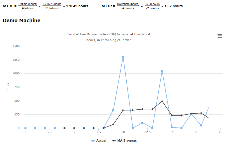
The Maintenance Metrics Overview displays pertinent information regarding the machine and selected downtime(s). In the example shown above, the mean time between failure is 176.49 hours, the result of taking the total machine uptime and dividing it by the number of failures (occurrences in the selected downtime). The mean time to repair is 1.62 hours, calculated by taking the total machine downtime hours and dividing by the number of failures.
Each trend chart is defined in fine print above it – the chart above displays the time between failure in hours. The light blue line displays the actual amount of hours between failures (shown on the x axis, oldest failure displayed on the left at 0 and newest on the far right) while the dark blue line shows the average of the last five occurrences. You can toggle these lines on or off by clicking their corresponding colors on the legend underneath.
You can also mouse over any point of the graph to see each point and its individual values.
Clicking the ![]() symbol will provide options to download the displayed graph as a .PNG, .JPEG, .PDF, or .SVG (vector) file.
symbol will provide options to download the displayed graph as a .PNG, .JPEG, .PDF, or .SVG (vector) file.
