The Dashboard feature of MONITOR allows users to get a deeper look at the data processes and statistics of an individual machine. Use the machine selection bar at the top of the page to select a machine and view its performance statistics.
This article covers all the information displayed on the data Dashboard – for information on the Productivity dashboard, see this article instead.
NOTE: This feature and relevant menu item was recently moved, from ei3’s PRODUCTION product to the MONITOR product.
Data Dashboard
If you click on the Dashboard menu item of MONITOR, this will take you to the dashboard page for data analysis.
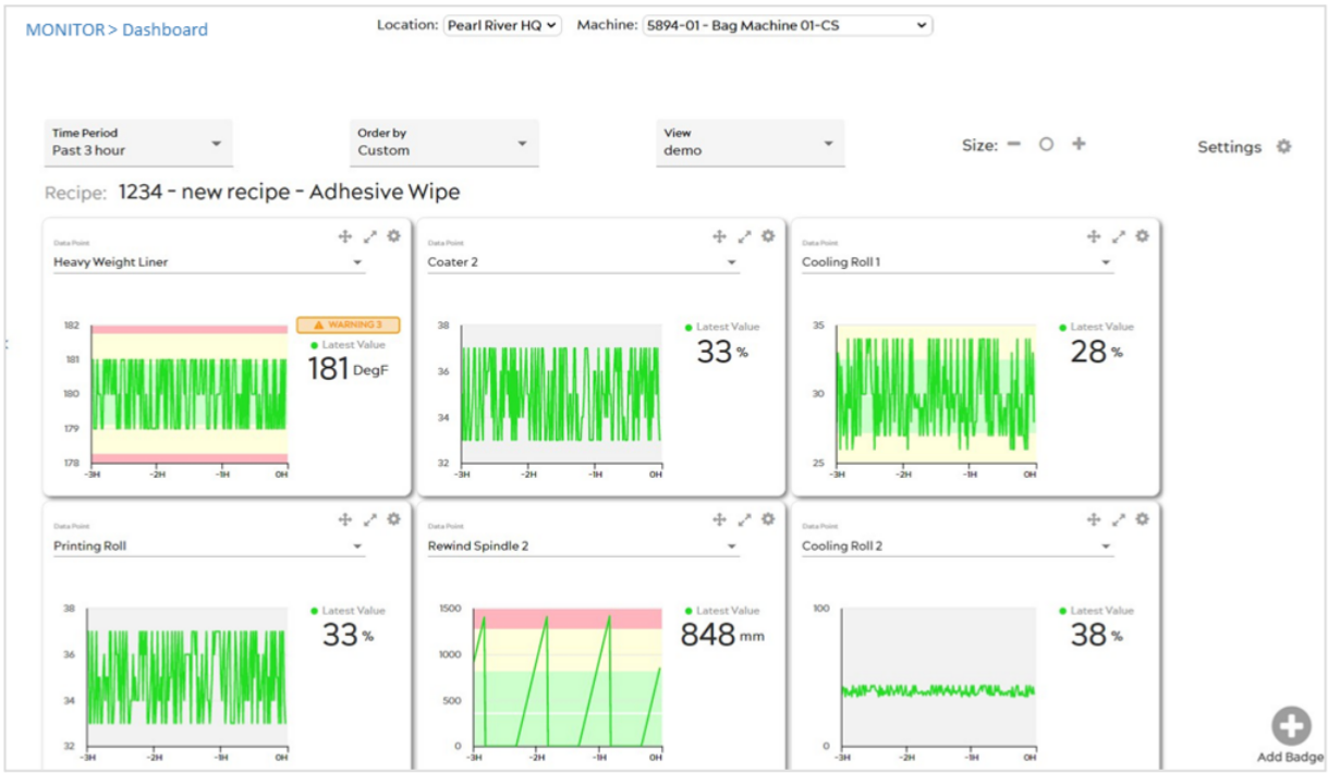
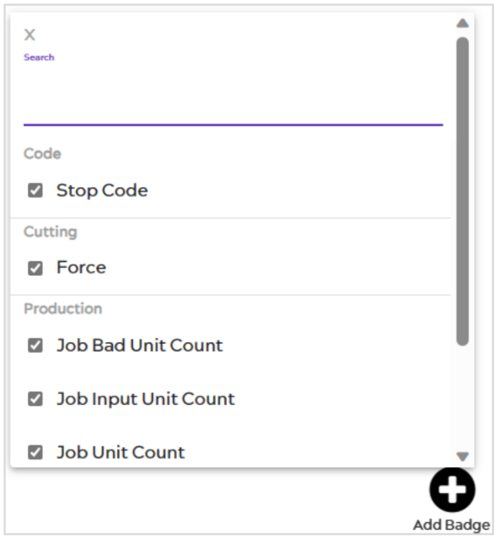
To get started, select a machine from the drop-down menu at the top of the page, then click the Add Badge icon ![]() at the bottom right of the page to select the data point you’d like to view. You can search for any data point by its tag name or description.
at the bottom right of the page to select the data point you’d like to view. You can search for any data point by its tag name or description.
The checkbox next to each data point in the list indicates whether the corresponding chart is currently displayed. You may click the checkbox again to hide the corresponding chart from the view. Repeat this as many times as you’d like to view multiple points, each with its own separate Badge for viewing.
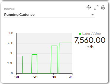
Move your mouse over any Data Point Badge to view a time-stamped, minute-by-minute value for each data point. The last-read value is displayed in larger font to the right of the chart.
Each badge can show either a normal machine data point, or a Recipe Management data point.
Machine Data Badges
When displaying a normal machine data point, the badge contains a line chart of the recent values, as well as the last value that was read.
Recipe Badges
When a Recipe Management data point is displayed on this dashboard, the chart will show both the actual (feedback) value and the Set Point values for that point, as well as the upper and lower limits, when available. The colors of these values are as follows:
Set point value – This value is shown with a blue line. Actual read value – This value is shown with a green line. ![]()
![]()
Upper and lower limits – These values are shown with red lines. ![]()
Dashboard Functions
At the top of the dashboard, several drop-down menus are available. These will allow you control of how to view the dashboard.
Time period – This selection adjusts the time period (in hours) of the data displayed on each badge of the dashboard.
Order by – This will adjust the left-to-right ordering of each displayed badge based on: the A-Z name of the point; the alert status of the point; or by a custom view order (click and drag the ![]() icon on each badge to move them into any desired order).
icon on each badge to move them into any desired order).
View – You can click this drop-down menu at any time to swap between existing views that you’ve already made, or to create new ones. Once a new view is created, you can add or remove new badges as desired.
Size – Like the machine badges on the Overview page, you can click the plus or minus icons to the right side of the page to adjust the size of all displayed badges. To reset badges to their default size, click the circle-shaped icon in between the other icons.
Dashboard Settings – The dashboard has a settings icon ![]() which provides additional view settings.
which provides additional view settings.
Add tag name – Checking this box will display the tag name for each displayed point in the name space for its badge.
Badge Functions
Data point name – The drop-down menu within the badge allows you to change the data point displayed on the badge.
Drag – You can re-order the badges on the dashboard to your preference using this icon. Click and drag the Drag ![]() icon to move a badge to a new location on the dashboard.
icon to move a badge to a new location on the dashboard.
Expand – Clicking the Expand icon ![]() will expand the selected badge to fill your browser screen. When in expanded mode, click the
will expand the selected badge to fill your browser screen. When in expanded mode, click the ![]() icon to return the badge to its original size.
icon to return the badge to its original size.
Settings menu – Each badge has a settings icon ![]() which provides additional view settings for that badge. Click on it to open the additional settings options.
which provides additional view settings for that badge. Click on it to open the additional settings options.
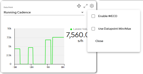
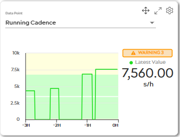
Enable WECO – Checking this will enable the badge to display color-coded bands based on standard deviations for that data point’s displayed values. The green band indicated plus or minus one standard deviation from the mean; the yellow bands indicate plus or minus two, and the red bands indicate plus or minus three standard deviations. ![]()
Additionally, the badge will display alerts for zone rules from WECO decision rules. You can read more about these WECO rules in this Wikipedia article.
The WECO checkbox is not available for recipe data points.
Apply axis min-max – Normally, the badge will display its X-axis to dynamically scale to match the displayed values for the data point. You can override this and make the badge use the set min and max data point values instead by checking this box. ![]()
Close – Clicking this will close the badge entirely and remove it from the display. You can re-enable it by clicking the plus icon ![]() on the bottom right of the page and selecting the point from the list.
on the bottom right of the page and selecting the point from the list. ![]()
Alerts
When the “Enable WECO” setting is enabled for a badge, it will display a relevant alert message whenever the most recently read data point values fall into any of the given WECO zone rules.
Recipe badges will also display an alert if the current value falls outside of the upper or lower limit values set for that point.