Users interested in charting their machine data over time have always been able to do it in ei3 using line plots (see MONITOR > Charts > Process Data). This visualization method, however, is not particularly suitable for some cases. One example includes displaying the amplitude of vibrations over time and across a spectrum of frequencies measured by ei3′s Symphony devices. Another case could be temperature measured in multiple locations across the machine. This type of data can be better visualized using heat maps.
This article discusses heat maps in the context of Symphony vibration data but provides instructions on how this visualization method can be applied to other data sets as well.
Finding heat map charts in ei3
In the Portal, go to MONITOR > Charts > Process Data. If the data for the currently selected machine is configured in a way compatible with heat map display, you will see the Heat Map display option, alongside the existing single-line and multi-line time series charting options:
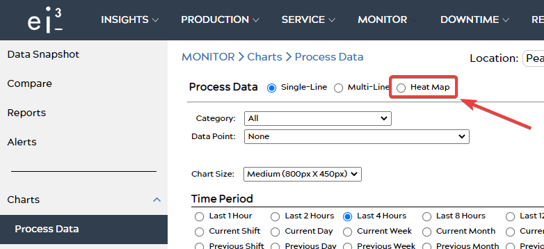
Select “Heat Map”. The display will then change to only show the following options:
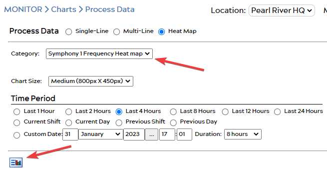
Select the category of data to be displayed as a heat map and the desired time period, and then click the “View” icon ![]() on the bottom.
on the bottom.
How to interpret heat maps
This is how a sample heat map appears:
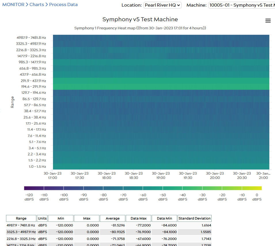
Data is arranged in a grid, with time on the X-axis and the selected data category on the Y-axis. In this example, the Y-axis is vibration frequency. The color of each data point corresponds to its value, in this case – the maximum amplitude of vibration within the defined frequency range. Under the heat map is a table that includes the minimum and maximum expected values as defined by the ei3 admin who configured the data points, and the summary of the data values for each point in the selected time period (data min, data max, average, and standard deviation). In this case, each point is used to define a measured frequency range, and the amplitude of vibration is expressed as decibels relative to full scale (dB FS); the value of 0 is the highest possible vibration amplitude, i.e. lighter colors represent more intense vibrations.
If applied to other types of data, for example, temperatures, one can imagine the Y-axis representing a range of locations across the machine, and the colors would indicate their temperature.
As you can see, heat maps let the user quickly spot any anomalies or unexpected changes in the values of the measured data points.
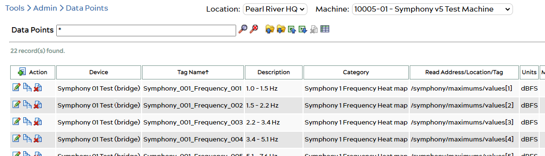
How to configure data points to be compatible with heat map display
To configure a heat map like the one shown above, the ei3 administrator must define the data points for the machine using the following method.
- The name of the data point category must include the word “heat map” (case-insensitive),
- All of the data points of that category will be displayed in the heat map,
- The data point descriptions will be displayed on the label alongside the graph’s Y-axis, sorted by the Tag Name. It is recommended to append the end of the Tag Name with integers in the sequential order in which the data points are intended to be charted on the Y-axis of the graph.