- How to Import Data into Power BI
- Displaying Downtime Data with Power BI
- Displaying Scrap Data with Power BI
- Refreshing Data
- Next Steps
How To Import API Data into Power BI
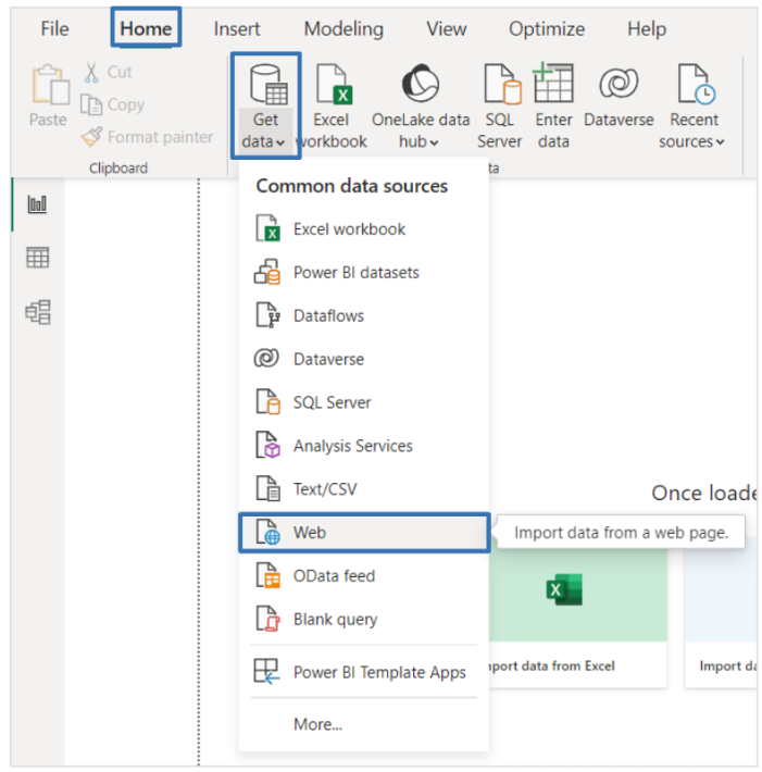
1. Once you have your desired API URL, start-up Power BI, then under the Home tab, select Get data > Web.
![]()
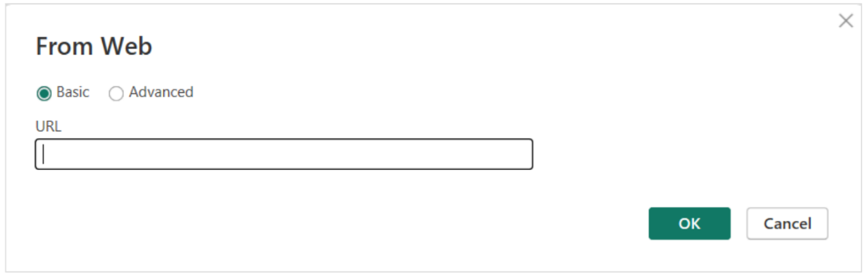
2. Paste the URL based on your apiKey, then select OK.![]()
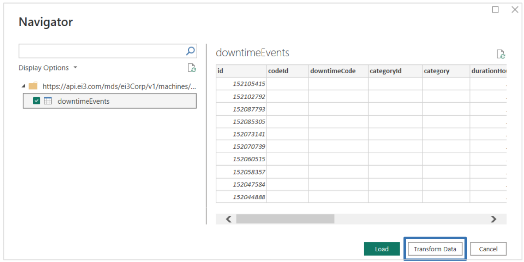
3. Select the appropriate data set to display, and click on Transform Data.![]()
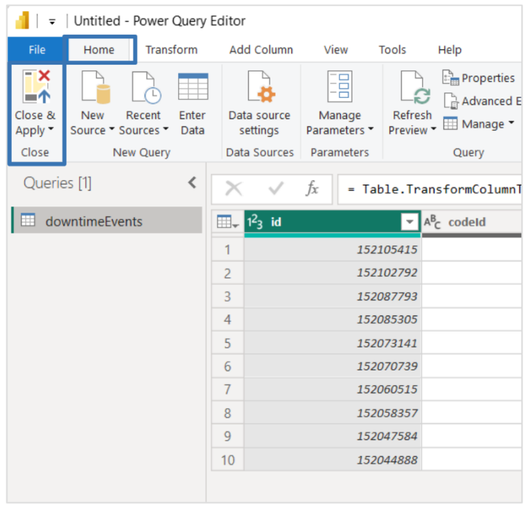
4. Now in the Power Query Editor, go to the Home Tab, on the top left select Close & Apply. Now your data will be imported into Power BI for further analysis.
![]()
Displaying Downtime Data with Power BI
Accessing Downtime Data and Importing into Power BI:
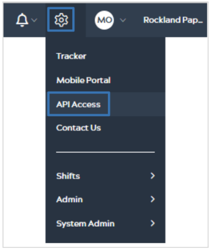
1. Click on the gear sign at the top of your ei3 page, then select API Access.
![]()
2. Scroll down on the page until you see the category Machine Service. Then select the Show/Hide button to expand this category.![]()
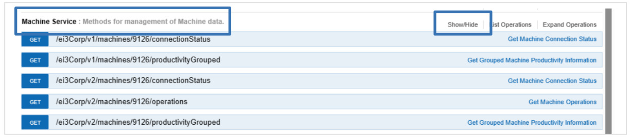
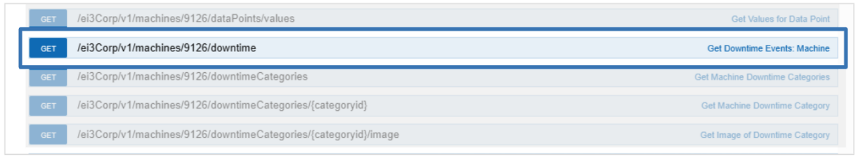
3. Scroll down the list of available API’s until you see Get Downtime Events: Machine, then select the GET button.![]()
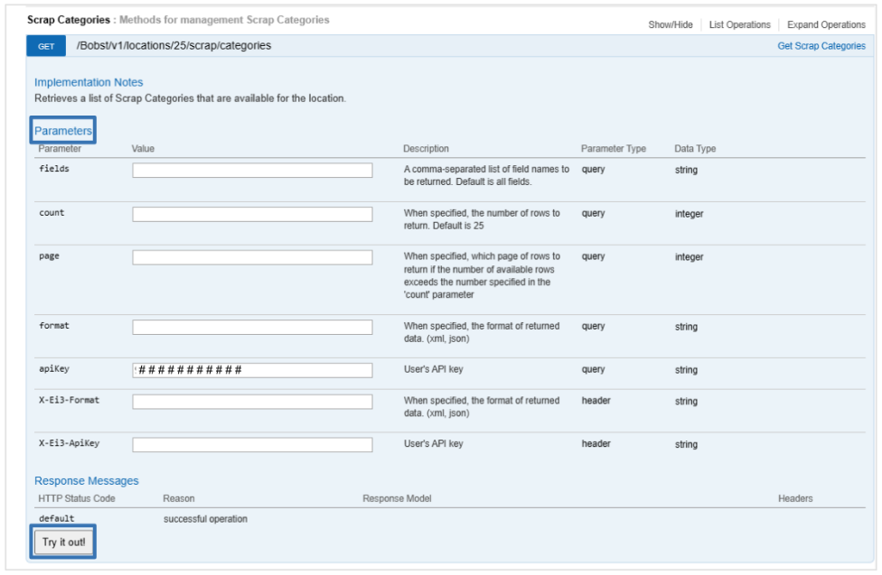
4. Enter all necessary values for the parameters and then select Try it out! Note that each user will have a unique and pre-filled “apiKey” so the resulting URL from clicking on “Try it out” will be one that is customized to you with your data access permissions.![]()
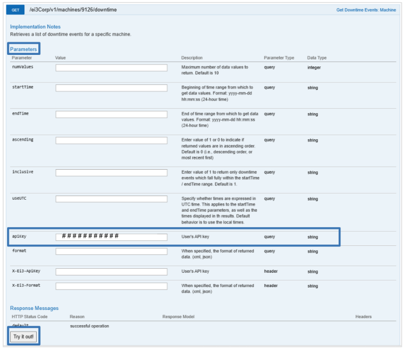
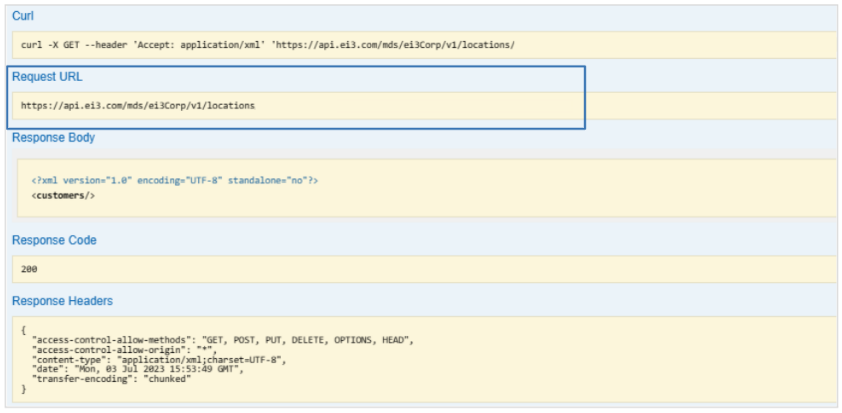
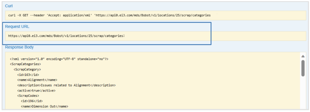
5. Copy the URL under “Request URL” to obtain the URL for your Downtime API.
6. Follow steps 1-4 from the previous section to import your data into Power BI.
Building Visualizations:
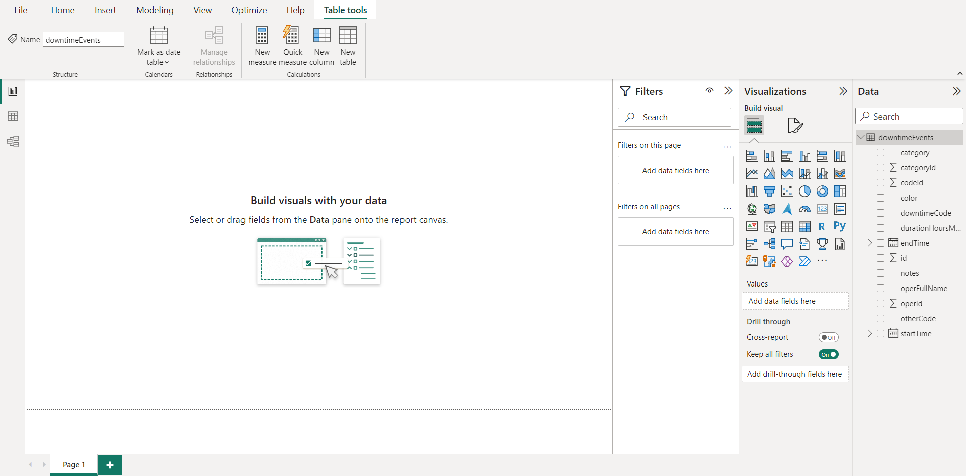
After importing the data, your screen will resemble the page below:
The right side of the page is where you will be selecting the details of your visualizations, and they will appear on the left side of the screen. There are a plethora of graphs/visualizations you can create including bar charts, pie charts, line graphs, scatter plots, and donut charts. There are some examples below of graphs you may want to create for your Downtime Data.
Downtime Categories Graph:
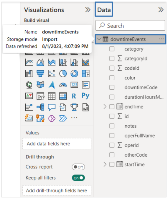
1. On the right-hand side of the screen under Data, expand the category for the data set you would like to use.
![]()
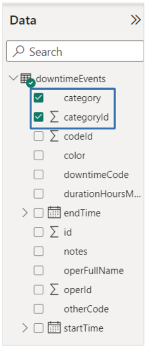
2. Select the category and Σ categoryID boxes. You will notice the left side of the page fills with the data of these two groups.
![]()
3. Now it is time to select which type of graph/visualization you would like to create. Under the Visualization tab, there are many options to choose from. For this example, a Pie Chart was selected. When you select which type of visualization you want, it appears on the left side of the screen.
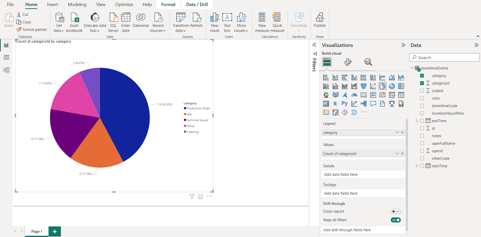
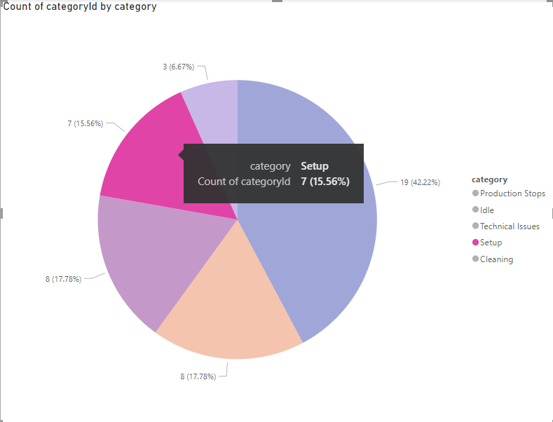
4. Selecting a segment on the pie chart will highlight that section, and hovering over it will display the data for that category as seen below. This can be done on other forms of charts as well.
5. You can Format Your Visual by selecting the ![]() icon under Visualizations, or Add Further Analysis to Your Visual by selecting the
icon under Visualizations, or Add Further Analysis to Your Visual by selecting the ![]() icon.
icon.
Downtime Codes Graph:
1. Click out of the Categories chart you just created, so that it is not highlighted on the left side of the page.
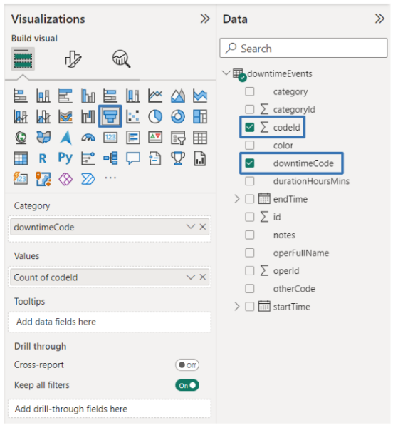
2. Select the downtimeCode and Σ codeId boxes under the Data tab on the right side of the page. You will notice the left side of the page fills with the data of these two groups.
3. Select the Visualization you would like to represent the Codes with. For this example, a Funnel Chart was selected.
![]()
4. You now will have two charts/visualizations on the left side of the page: one for Categories and one for Codes.
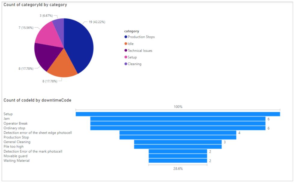
![]()
5. These two graphs will now interact with each other, and recognize which codes are associated with which categories. For example, selecting the second code in the Funnel chart named Jam, will not only highlight that code in the Funnel chart but show how the percentage it represents within its category. As you can see, the Category Pie chart now has the Production Stops category highlighted, but only a small portion of it. This highlighted portion represents the Jam code.
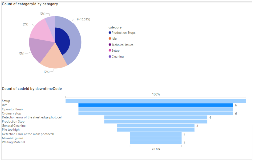
![]()
6. Once again, hovering over data in your charts/visualizations will reveal the statistical information about that code/category. You can also edit the graphs however you please using the features Power BI offers.
Displaying Scrap Data with Power BI
Accessing Scrap Data and Importing into Power BI:
1. Click on the gear sign at the top of your ei3 page, then select API Access.
![]()
2. Scroll down on the page until you see the category Scrap Categories and Scrap Codes. Then select the Show/Hide button to expand both of these sections. Select the GET button next to the first API shown for both (Get Scrap Categories and Get Scrap Codes). Since you cannot get both API’s at the exact same time, select Scrap Categories first, then after getting importing into Power BI, repeat it for the Scrap Codes. 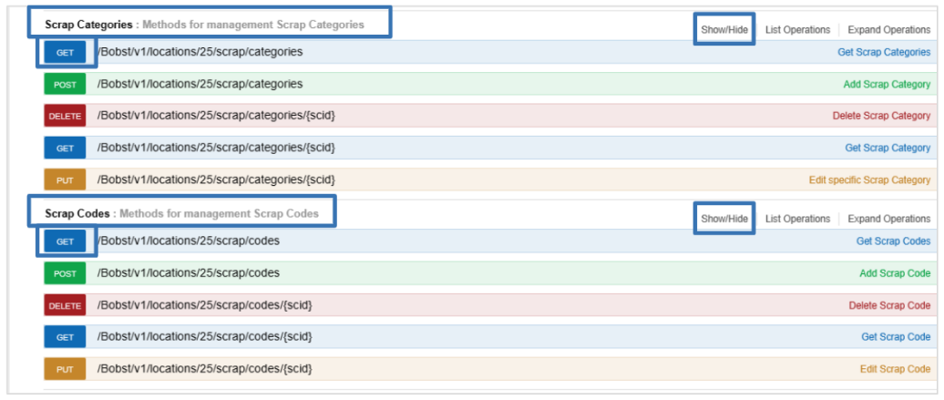
3. This entry panel will now appear where you can enter all necessary values for the parameters based on your personal preference. Once all necessary parameters are filled in, select Try it out! Note that each user will have a unique and pre-filled “apiKey” so the resulting URL from clicking on “Try it out” will be one that is customized to you with your data access permissions.![]()
4. Copy the URL under “Request URL” to obtain the URL for your Downtime API.![]()
5. Follow steps 1-4 from the first section to import your data into Power BI.
Building Visualizations:
After importing the data, your screen will resemble the page below:
The right side of the page is where you will be selecting the details of your visualizations, and they will appear on the left side of the screen. There are a plethora of graphs/visualizations you can create including bar charts, pie charts, line graphs, scatter plots, and donut charts. There are some examples below of graphs you may want to create for your Scrap Data.
Scrap Categories Graph:
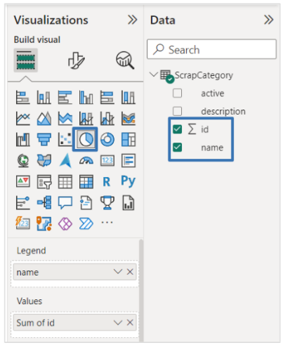
1. On the right-hand side of the screen under Data, expand the category for the data set you would like to use.
2. Select the name and Σ id boxes. You will notice the left side of the page fills with the data of these two groups.
3. Select the Visualization you would like to represent the Codes with. For this example, a Pie Chart was selected, but there are many other options you can choose from.
![]()
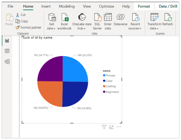
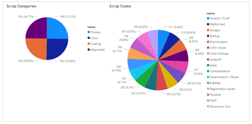
4. Your Scrap Category visualization will now appear on the left side of the screen, displaying a breakdown of the user-assigned scrap, and which categories they belong to.
Scrap Codes Graph:
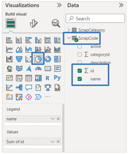
1. Go back to the API Access and follow these steps, now for Scrap Codes.
2. Click out of / deselect the Categories chart you just created, so that it is not highlighted on the left side of the page.
3. Select the name and Σ Id boxes under the Data tab on the right side of the page. You will notice the left side of the page fills with the data of these two groups.
4. Select the Visualization you would like to represent the Codes with. For this example, a Pie Chart was selected.
![]()
5. You now will have two charts/visualizations on the left side of the page: one for Categories and one for Codes. You can edit the Titles on the charts by selecting the ![]() icon under Visualizations, then going to the Genral tab.
icon under Visualizations, then going to the Genral tab.![]()
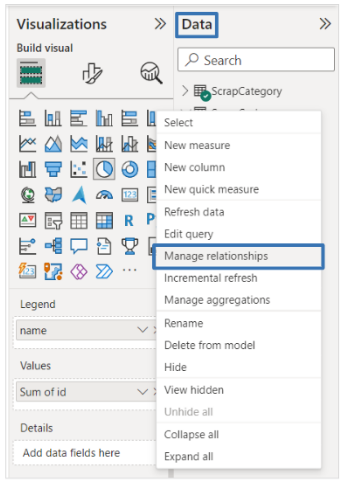
6. To get these two charts to interact with each other, go to the Data tab on the right side of the screen and click on the three dots next to ScrapCode, then Manage relationships.
![]()
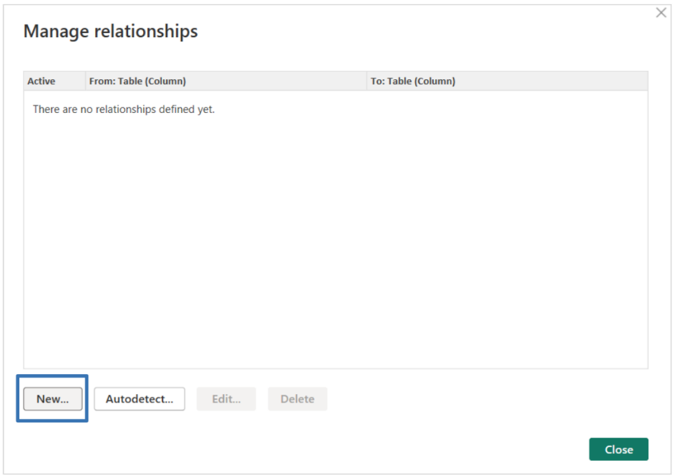
7. A window will pop up, where you can see the data’s relationships and select New.
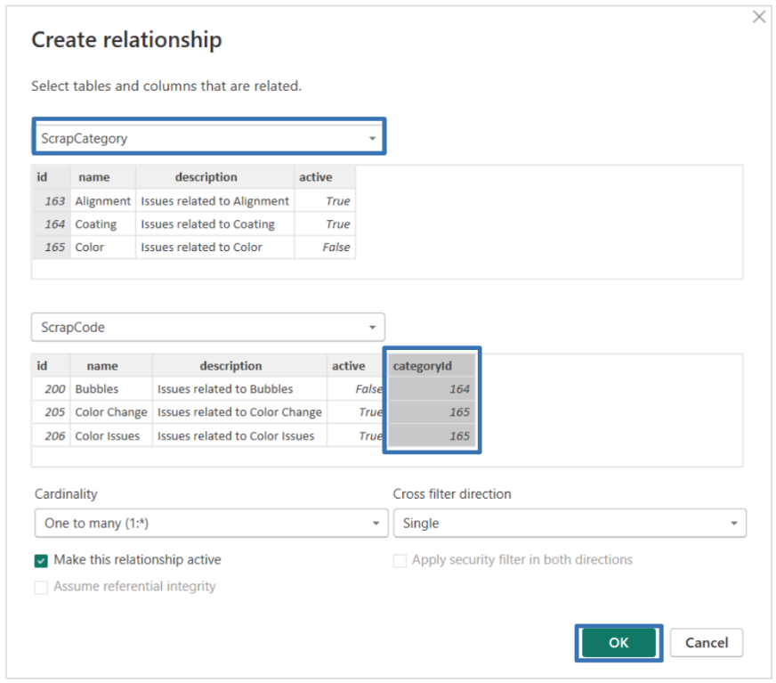
8. A new window will appear where you can create a new relationship. In the first dropdown, select ScrapCategory, and the information will autofill for both that dataset and then the Scrap Codes below. Select the column called categoryId in the Scrap Codes section, then select OK to finalize the relationship.![]()
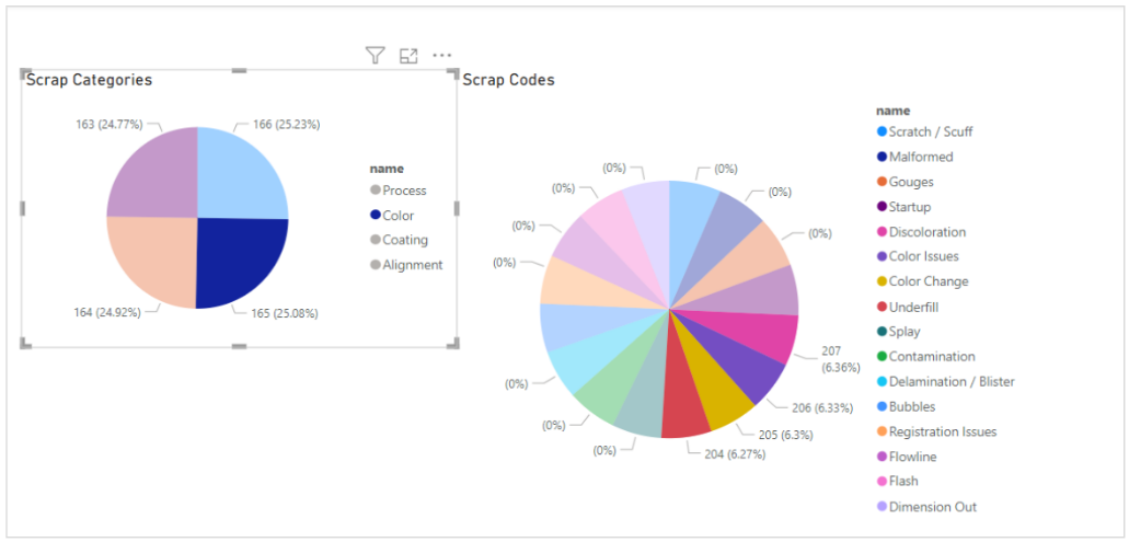
9. These two graphs will now interact with each other, and recognize which codes are associated with which categories. For example, selecting the category named Color in the Scrap Category pie chart, will not only highlight that code in the Funnel chart but also highlight the codes in the Scrap Code pie chart associated with the Color category. As you can see, the Scrap Codes pie chart now has the four codes associated with Color highlighted.![]()
Refreshing Data
Method 1:
1. Select the visualization you would like to refresh.
2. Go to the Home tab, then select Refresh.![]()
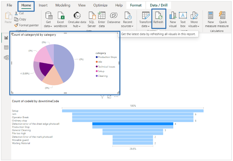
3. Your data will then be manually updated.
Method 2:
1. Go to the Optimize tab, then select Refresh Visuals.![]()
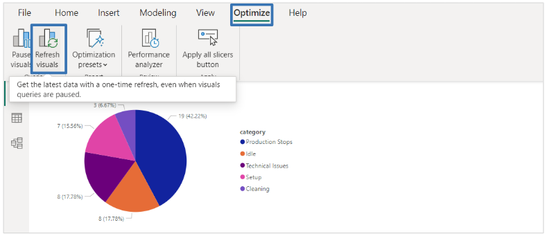
2. Your data will then be manually updated.
Method 3:
1. Select the dataset you want to refresh under the Data tab on the right side of the page.
2. Select the three dots to see More Options.
3. Select the option that says Refresh Data to manually update the dataset.
![]()
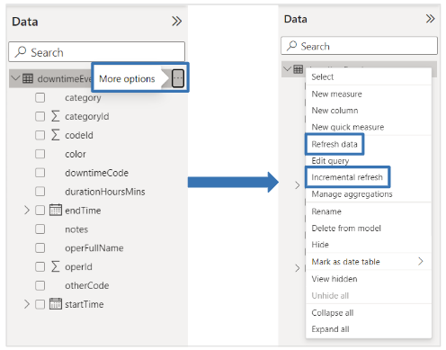
4. You could also choose to set up an automatic Incremental Refresh for the data. See this article for more information: Incremental refresh and real-time data for datasets
Next Steps
Now that you know how to use the ei3 API with Power BI you can think about creating powerful data exploration tools to help run your manufacturing operation. The team at ei3 is ready to help you understand what is possible and how to use ei3 data as a way to enhance your productivity. So please keep us in mind as you go through the process of imagining the scope of your Industrial IoT solution!
