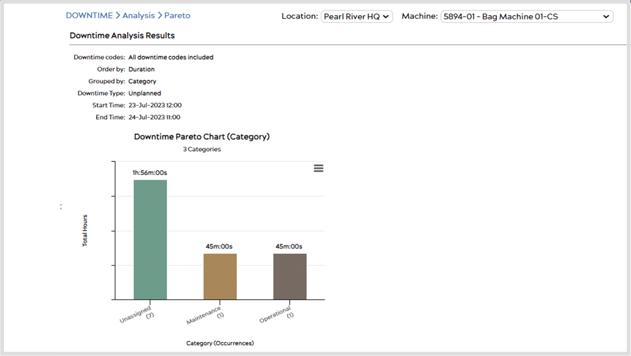
Use Pareto to analyze the impact of your machine’s downtime. You can access the Pareto tool from the top menu bar through DOWNTIME > Analysis > Pareto.
Setup
When you first enter the Pareto page, you will be prompted to select what you wish to analyze in your Pareto Analysis.
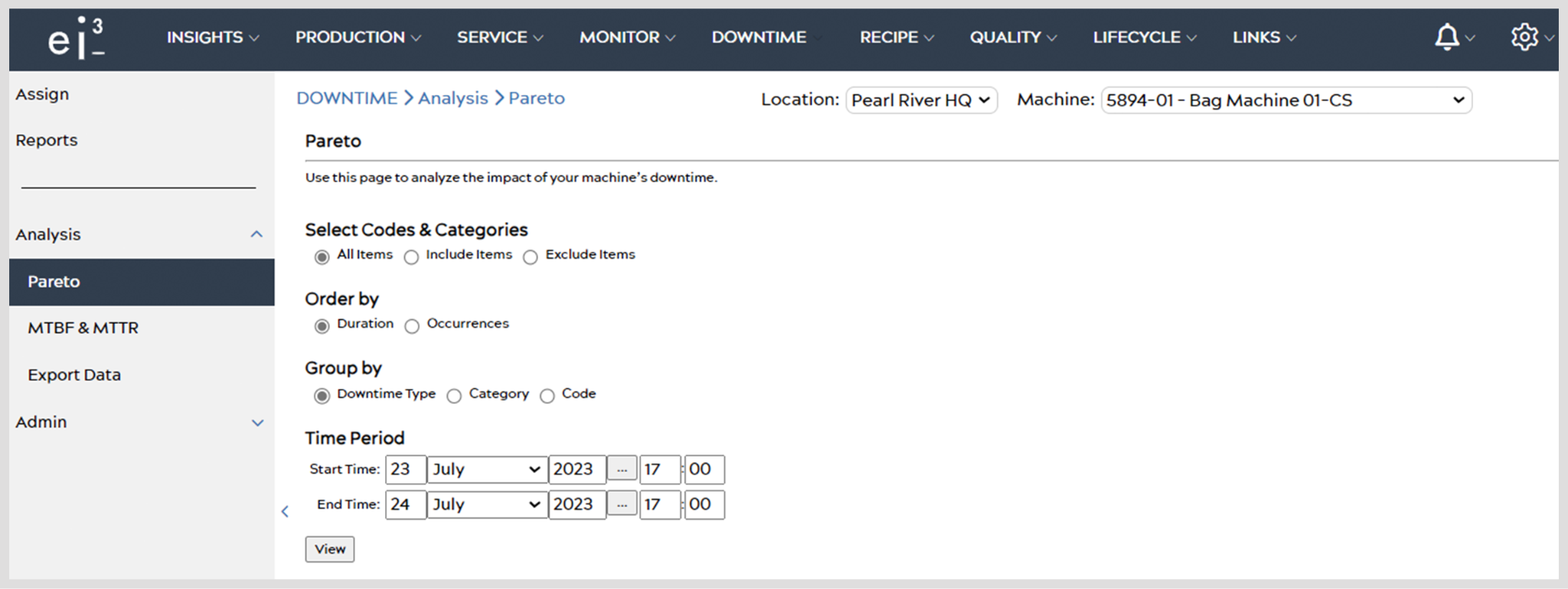
Select Codes & Categories – Choose from the radio buttons to personalize your Pareto analysis. Choosing an option will display additional selection tools based on your choice.
Order By – Select an option to order downtime categories.
Group By – Choose how to group downtimes in Pareto analysis.
Time Period – Customize a time period from which downtimes should be analyzed.
Once you’ve completed your selections, hit the View button. A Pareto analysis will generate based on your choices, displayed in both a bar graph and a pie chart.
Analyzing Data
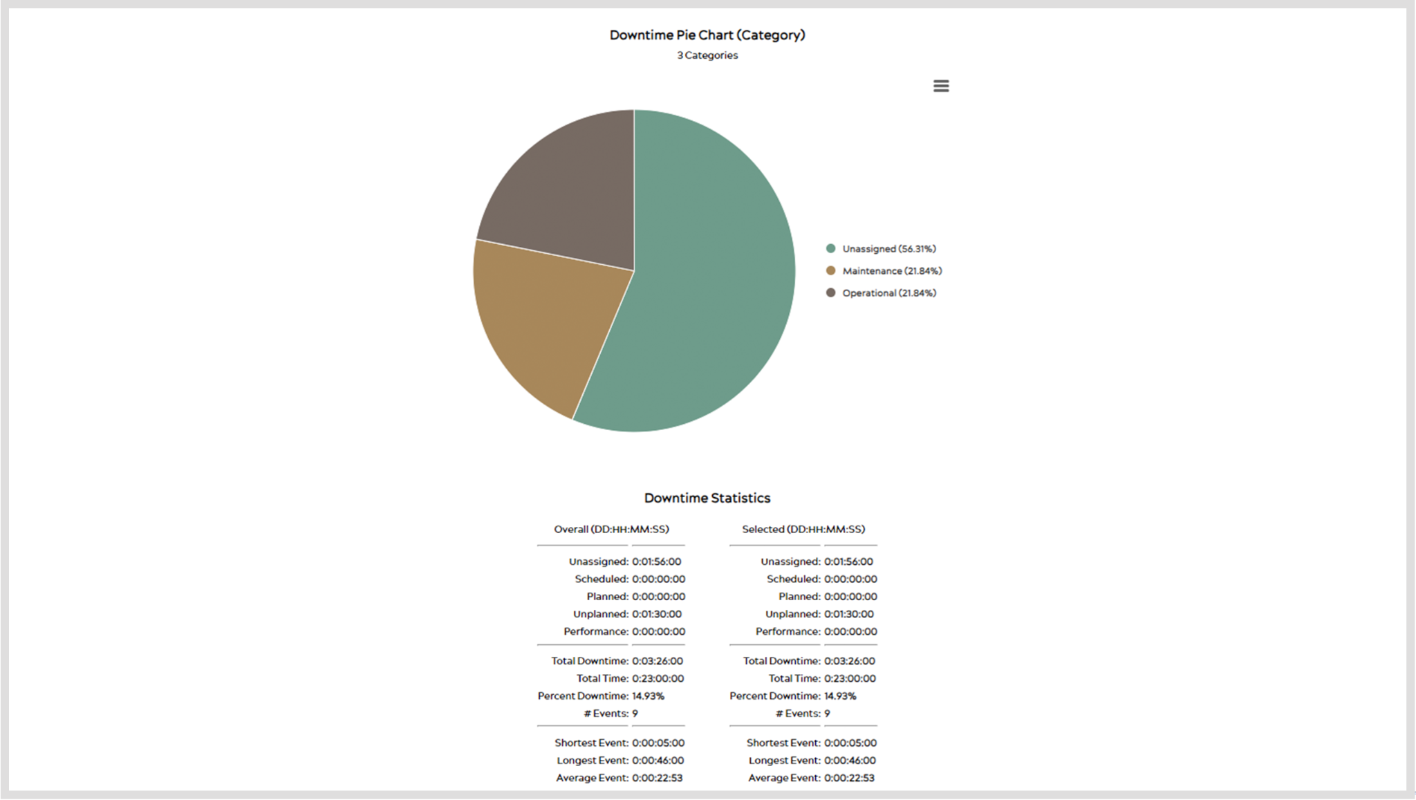
After selecting View, the first thing you will see is the Downtime Types page, shown below. On this page, you can see a histogram and a pie chart, displaying the Downtime data.
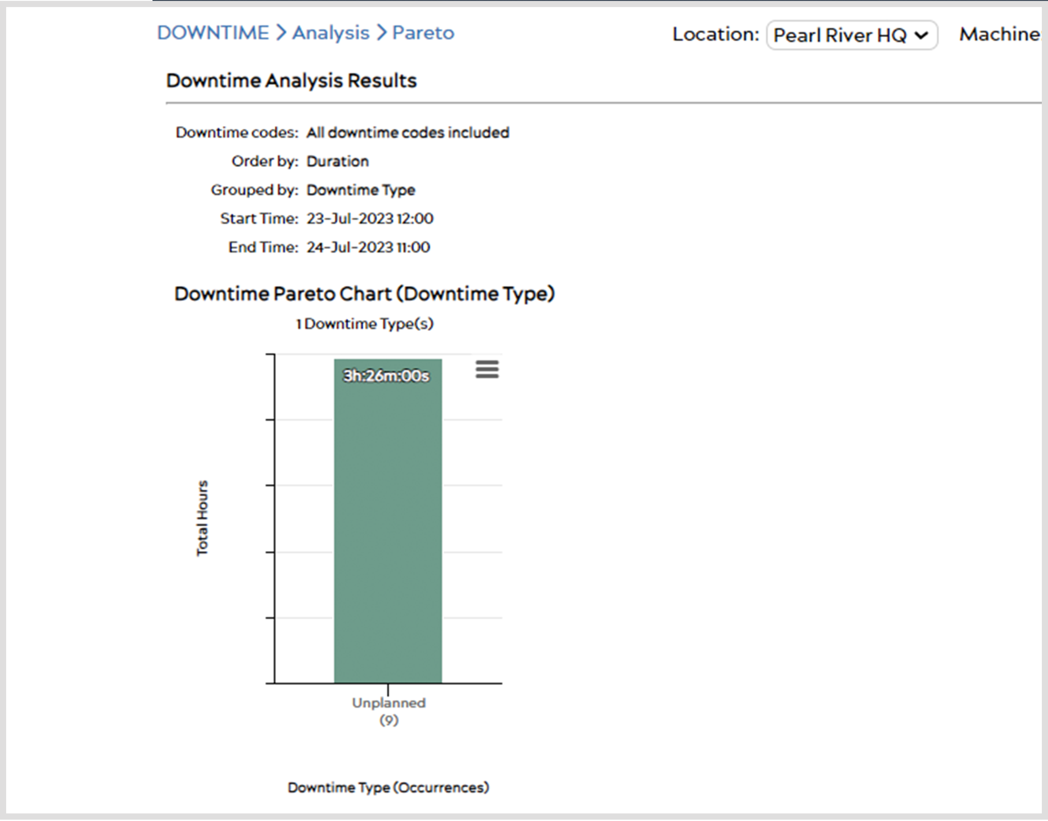
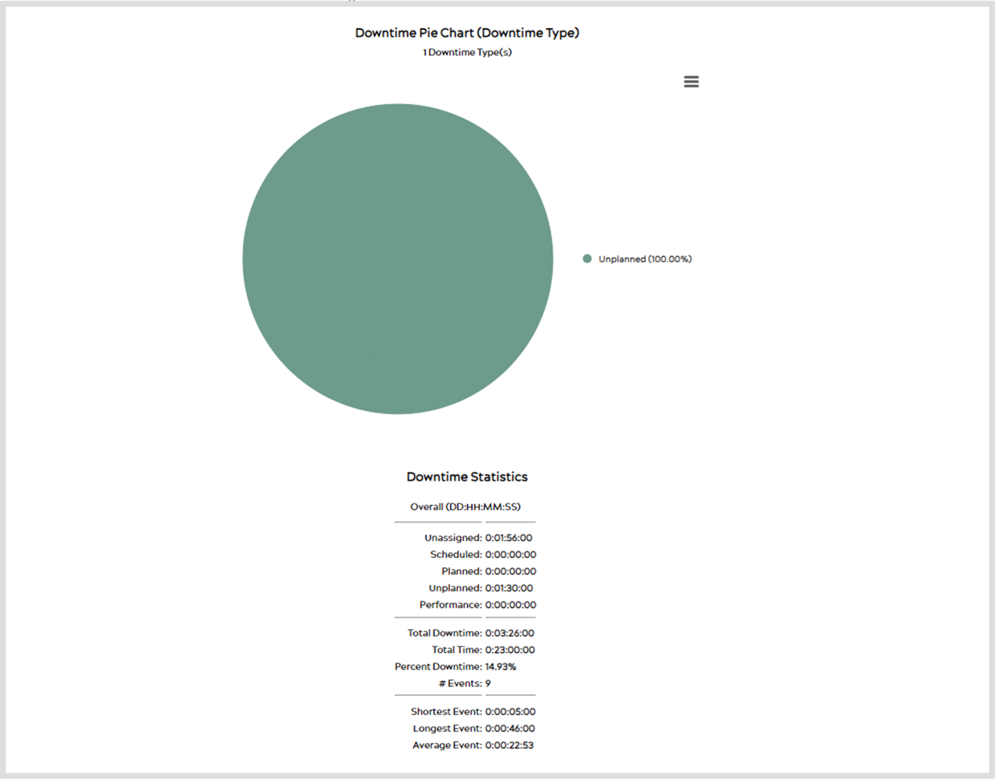
At the bottom of this page resides all the statistical information about this data.
Hovering over the histogram or pie charts will show you the number of occurrences and the duration.
Clicking on either of these charts will then take you to the Downtime Categories page and then Downtime Codes. Like hierarchical levels, it drills down from Type > Categories > Codes.
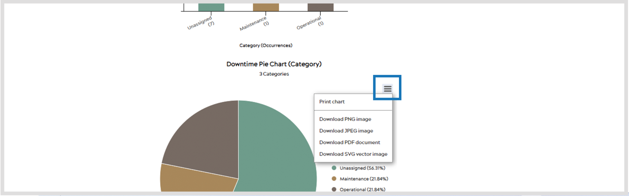
Saving Graphs
Click the ![]() icon at any time to save the currently displayed graph as a PNG, JPEG, PDF, or SVG file. You can also print the currently displayed chart using this function.
icon at any time to save the currently displayed graph as a PNG, JPEG, PDF, or SVG file. You can also print the currently displayed chart using this function.